Total: $0
Taxes and shipping calculated at checkout


“Color is a power which directly influences the soul.”
–– Wassily Kandinsky
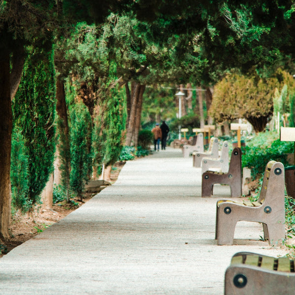
Seeing red. Green with envy. Tickled pink… There’s no denying that the influence of color reaches beyond the visual realm. Decorating mindfully means we take into account color awareness, realizing that below the surface, each pigment speaks to our subconscious. And like a creative spell, these vivid hues possess the capacity to evoke feelings, alter moods, and positively impact our lives.
For centuries, color has been used as a method of healing. During the German Renaissance, Swiss doctor and alchemist, Paracelsus, worked with herbal medicine and helped pioneer the field of chromotherapy (color therapy), using light and color to treat ailments. While his work was truly groundbreaking, unfortunately, the alchemist was too ahead of his time to be understood, leaving his work unappreciated during his lifetime. Meanwhile, in the East, the ancient Indian text the Vedas, gave birth to the Chakra System, which represented various energy centers throughout the body, each associated with a different color.

As a Yoga teacher and artist, I always find the ritual of mixing paint to be very meditative. Starting with a tube of white, and three primary colors, (red, blue, yellow) I methodically stir them on my palette. As the pigments blend and swirl, I get lost in a sense of flow, until the just the right shade eventually reveals itself. When decorating, it also helps to incorporate the same sense of slowness, especially when it comes to picking your personal color palette. Instead of choosing a tone based on how pleasing it is to the eye, take a deeper look. Allow yourself time to go within, think about the feelings you wish to evoke.
There’s nothing black and white about selecting color. So… to help you choose, here’s a breakdown of tones, and the chakra it’s associated with.

Soft, feminine and nurturing. Fill four walls, accent, or use to compliment another color. Shades of lavender and violet, summon up inspiration and the magical.
Crown Chakra: thought, wisdom, intellect.

A little of this intense pigment goes a long way. Even in tiny amounts, indigo can add strength, depth, and power. Too much indigo can overtake a space. So experiment with it as a complimentary shade before using larger amounts. Find your natural balance, and indigo can be magnetic.
Third Eye Chakra: intuition and integrity, the pathway to psychic realm.

Sky, ultramarine, or royal: blue represents comfort and inner calm. Depending on how light or dark the shade, it can open up or shrink a space. Go especially slow when choosing… Undertones of red or green will also alter its feeling. Lighter blues lend a sense of mind/body wellbeing to a room
Throat Chakra: the voice, communication, and listening.

Complexity lives in green. It denotes nature and innocence, yet can also represent ignorance and envy. Create a color wash, use to accent, and consider adding plants for some earthbound harmony.
Heart Chakra: love, jealousy, balance.

Light in a bottle, golden shades can bring sunshine, cheer, and promote an overall joyful energy. In its palest incarnations, yellows can widen a space and foster an airy vibe.
Solar Plexus Chakra: energetic, success, individuality, fire.

Strong-willed, filled with imagination and positive energy. Tones of orange promote focus and learning. Be mindful, too much orange can dominate a space. So use sparingly. This passionate hue is a natural way to draw the eye and bring creative inspiration.
(Sacral Chakra: compassion, sexuality, attraction)

Known for its boldness and ability to evoke heat, passion and desire. When deciding where to place red, know it will stand out as a power center. So choose wisely. Red-blues are cool and red-oranges are warm.
(Root Chakra, links us to nature, grounding)
What meets the eye can be deceptive. So resist the urge to be swayed by trendy decorating trends regarding color. Instead, keep in mind the undercurrent behind the hue and the feeling it evokes. Take extra time when perusing colors. Breathe into the moment... Let the act of choosing be a whole/body experience. Pause... Envision where and how the shade will live in your home.
Notice how the visualization makes you feel. Maybe magenta looks gorgeous in a small swatch, but when you imagine living with it on four walls, day after day, it creates anxious feelings. Be flexible. Try visualizing it on one wall, or as an accent. See what feels right. Explore different shades you may not have previously considered. Allow for exploration and enjoy the creative journey.

 USD
USD